They say you shouldn’t judge a book by its cover; but the fact of the matter is that almost everyone does. This is why bestselling books have great covers, and the same applies to label design. No matter how great your product is, if the label is lousy then your sales will be too. Below are some tips that will help you create eye-catching labels that will get your products noticed, picked up and carried to the checkout line.
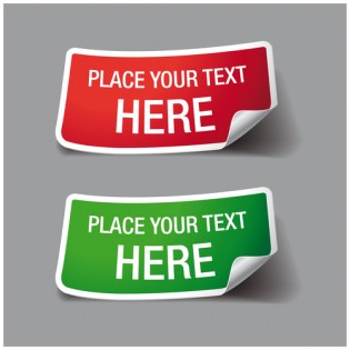
Pay Great Attention to the Text
Research indicates that the text which appears on the label has roughly three seconds to attract the interest of potential buyers. Therefore, it is important for the text to be easy to read, and the label should showcase the brand name along with at least three words that describe it. Anything more than a four-word description is too much; less is more in this case. Additionally, never use standard fonts which are found on most computers; find something that is unique, attractive and readable.
Choose the Color Wisely
The right amount and type of color will make your label vibrant, exciting and attractive. When selecting colors, there are a number of factors to consider, such as color perception and psychology. The label design should not be the same as the packaging itself, but they must complement each other. Software can be used to select the perfect color combinations.
One property of color is that it transmits information more rapidly than text, so it is crucial to make sure you get it right. The identity of your brand must be followed by a color scheme which is distinct. This scheme should appear in all the marketing materials, such as the brochure, website, leaflets, advertising, etc. This consistency will reinforce your brand while making your merchandise stands out from others.
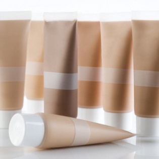
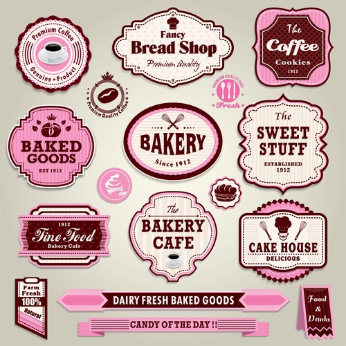
Your Images Should Be Attractive and High in Quality
The best labels are those which provide a perfect balance between text and images. Balance will generate a synergy in the way the label is perceived, increasing the overall impression. The image used should be attractive, unique, high resolution and consistent with the product you’re selling.
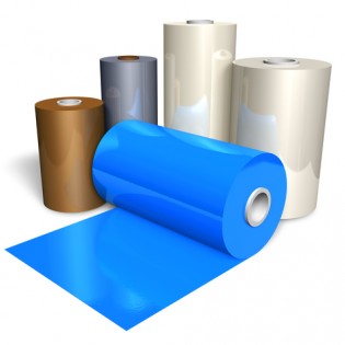
Think About the Material of the Labels
The material of the label should be chosen before you start on the design. This includes the surface texture, paper type, and whether it will be transparent or white. It may be helpful to create a group of test products that feature different finishes so you can see which works best for buyers. It is also important to consider the number of labels you want to have on the product. The majority of products have one or two labels; more than this is likely to be overdoing it.
The advantage of having two labels is that information can be evenly distributed between them. For instance, if you sell whiskey, you could have one bottle label on the front which shows the name of the brand, with a second label on the back which has a description. This will enhance both recognition as well as visual appeal.