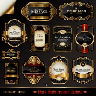
Sometimes you encounter packaging that is beyond words; so pretty, so stellar it simply takes your breath away. You look at the packaging again and discover it is not just the packaging that is perfect. The product features breathtaking labels, designed to perfection. It then hits you that as a small business owner, you too can come up with stellar self-adhesive labels for your product. The thought seems distant at first. Over time, you get convinced that it can be done. Unfortunately for you, you know little about designing self-adhesive labels. It is easy. You will in fact, discover that so many of the so called breathtaking designs are simple at their core. They are only thoughtfully designed. Here’s what you need to consider.
Typography
Typography is a major transforming element in graphic design. With it comes along a wide range of options. You can choose the classic serif and come up with an aspirational product or take things a notch further by going for a pared back sans serif. Master these two options and pitching a neatly packaged and labeled product becomes easy.
Wine, hard liquor and beer bottles make use of typography to make sure their labels stand out. Most, if not all champagne and wine labels use traditional serif typefaces. Some use heavily tracked headers in a bid to communicate quality. Beer bottles feature grunge typefaces or informal sans serif to highlight and emphasize the laid back, chill mode and relaxing nature of beer.
Natural Color Palettes
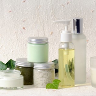
Colors are just as important as designs. Nature inspired tonal colors always have a calming effect. They tap into the general trend for all commercial products. What’s more, they stand out as more eco and ethic conscious options.
Use tints of bright colors to come up with a wash effect to packaging. You can also opt for team colored elements with card or natural brown paper. This always works out well with soap products and other non-consumables. Remember that even for products that are not 100% organic, or do not comes fresh form the farm, you can still achieve a touch of wholesomeness by going for pared back color palettes.
Photography
Labeling trends come and go. Some remain relevant for decades. There’s one trend though that’s always in flux – graphics. Graphics that feel appropriate will always win consumers’ hearts in a second. As it is today, simple typographic designs or illustrated graphics trend. Photography is however taking the centre stage. It can look relevant and stylish once designed the right way.
To achieve a sleek and appealing look, stick to striking graphic images. Creativity plays a big role here. One wrong move though can prove fatal. This should not discourage you. Trial and error always works until one finds a formula that works. For instance, you can choose to use black and white photography with minimalist designs. Teamed up with the right typography, the end result is always stunning. You can also choose to add solid color graphics and art set behind snow white texts to give your designs an ultra-modern look and feel.