Special attention must be given when food and drink labels are designed for commercial purposes. At the very first glance, the label should convey freshness, look tempting and give your consumer the kind of information they are looking for. Food labeling is one of the vital tools to connect with your customers, especially when your business is running on low budget marketing. Enlisted below are some of the most common labeling mistakes you should avoid.
Excessive Use Of Fonts
It can be tempting to choose all your favorite fonts when looking to design your label in the best possible way. However, this can turn out to be counter-productive! You are trying to communicate a vital piece of information to customers of all vision abilities, right from senior to kids. Keep the entire layout as simple as possible, without comprising the appeal.
Brand Name is Too Small or Too Big
There should be some sort of balance between the size of your product information, brand name and other text on the label. You don’t want people to miss out on important information, but also you don’t want your brand’s name to be overshadowed. Make sure it’s quite prominent on the sticker, followed by the product name and the relevant details.
Unreadable Fonts
Your product will keep warming the store shelves unless it’s good enough to seek the attention of a buyer at the first look. Clean and simple fonts are easier to understand rather than the fancy ones. On the other hand, decorative fonts can be used only if you are conveying a style, which isn’t really required in a majority of businesses. Too much of decoration can confuse the reader, and they’ll probably move one. Always test your labels in two different versions, just to see how people react. Test marketing of label design can help your business perform well in the long term.
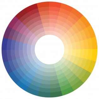
Non-Complementing Colors
There’s a clear difference between an ordinary and an extra-ordinary label. Designing a label requires careful selection of colors that complement each other. The idea is to avoid any kind of distraction from the message you are trying to convey. Say for an example, you can use green shades for an organic product or a red one for a non-vegetarian stuff. You just have to make sure they are not too deep running over the text.
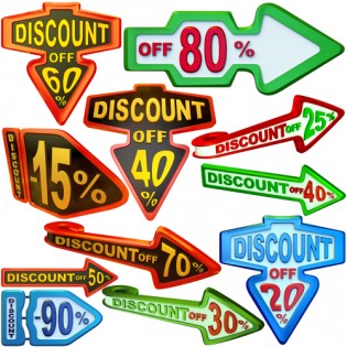
Too Many Images
Putting an attractive image on your label is a good idea, but overcrowding it with too many stuff can outdo the point you are trying to make. Clear vision is very important if you are looking to grab someone’s attention. Complicating things in an already small space can mess up your label as well as your business.
Contrasting Message
The main objective behind applying customized labels on a product is to let out the message straight and clear, without any ambiguity. Too much or too less information is equally damaging for the business. Labels are not a good place to add needless puns that doesn’t work with the company’s name.