Color psychology is an important concept you have to grasp when you need to incorporate colors into your product label designs. The product label is an essential marketing vehicle, and the colors you choose and use will possess the potential of making or breaking your sales. Hence, you might want to drill these color theories into your memory before beginning your label’s printing process:
You Should Send CMYK Artwork Files to Your Label Printer
Also known as the four color process, CMYK (cyan, magenta, yellow and black) is an image color mode that is used to reproduce full color images. The letter K stands for the black key plate that all printers used before digital printing was invented. The key plate is something contains all the artistic detail or key information for a print. K was also added in the back to avoid potential confusion with another very popular color model called RGB. RGB stands for red, green, and blue and is used by televisions and monitors to represent color. Today, most label printers and digital printing presses handle CMYK. If your label designs are sent to the printer in another image color mode, you will have to convert it to CMYK. However, that might cause your artwork to appear differently when printed.
Create Legible Combinations of Background and Text Colors
It can be daunting at first when you are choosing legible combinations for your background and text colors. However, you can make the process much more manageable by following some basic principles of color theory for your label designs. The key to successfully pairing is none other than contrast. It is the contrast between hues as well as values (lightness and darkness). By increasing the contrast between the two, you can increase the legibility of your text. In addition, it can minimize eye strain and help you achieve a design that is aesthetically pleasing.
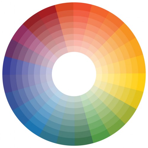
When it comes to adding contrast in both value and hue, complementary hues provide the greatest amount of contrast. Also, they are located across from each other on a color wheel. For starters, you may select background and text colors by pairing a light color from the top half of a color wheel with a dark color from the bottom. Here is a quick list of the possible combinations (from least legible to most legible):
- White on red
- Red on white
- White on green
- Green on white
- White on blue
- Blue on white
- White on black
- Yellow on black
- Black on white
- Black on yellow
Take Advantage of Color Psychology – Make it Work for You!
To gain a better understanding on each color, take a look at the meanings that come with them:
- Black: Stability, rationality or sorrow
- Brown: Security, relaxation or vitality
- Orange: Hunger or clarity
- Purple: Prestige or introspection
- Yellowish green: Nausea
- Bright yellow: Danger
- Light yellow: Spontaneity, optimism or cheerfulness
- Red: Sensuality, warmth or danger. Has the ability to increase one’s heart rate
- Dark blue: Corporate, trust or sadness
- Light blue: Spirituality or comfort
- Green: Peaceful, happy and can reduce blood pressure
- Pink: Can sometimes represent fatigue, but mostly about tranquility
- White: A sense of lightness, but can mean complacency or security as well