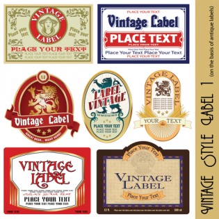

A champagne label might be small or sound like a component you shouldn’t spend too much time on. This does not mean though, that the small label cannot pack a punch. If anything, champagne brands with small labels sell more than the ones with bigger, conspicuous and overly detailed labels. There are so many theories why this happens. One theory is that today’s wine connoisseurs know what they want in champagne and wine in general. They are of the view that labels that are too detailed try to convince them to but something that may not be so good after all. That theory aside, brands are always exploring new ways to make their products stand out as unique. As a result, collaboration with photographers and artists are now so common. But even then, your champagne labels should never miss out on the following label components.
Go Artsy
You don’t have to have an internationally renowned artist on your speed dial or an award winning photographer on your payroll. Put on your artistic hat and get the labeling job done. Unusual type styles, painterly finishes and unique hand drawn illustrations always look appealing on packaging. They will go a long way to help you stand out from the crowd.
Appeal To Sexes
It is true that most retailers tend to pitch their products at a unisex market. This does not mean in any way or even suggest that there isn’t a clear visual divide in products that are specifically aimed at women or men. For products aimed at young men, such as shaving and grooming products, theirs is, as has always been, a strict design code as to which sort of colors and designs that will convert to sales.
Be keen with your choices though. Traditional blue for boys and pink for girls is one lazy way of trying to appeal for either sexes. Add a unisex, feminine or masculine to your labels with strong color codes. Black and white always work for men. They seem to prefer dark colors with subtle hints of bright colors. This is not the case with women. Brighter colors appeal to them. In that regard, you have no choice but to be creative with your color codes and even text typography.
Pattern Choices
This applies more to labels designed to impress women. Unfortunately, there is a common misconception that feminine designs only appeal to women. The exact opposite is true. Adding feminine elements to packaging and labels only means you are introducing specific qualities to your labels which more often than not, have a broader market appeal including beauty and elegance.
Be creative with your champagne labels. But do not forget to add patterned designs to packaging. It is a smart way to bring about beautiful quality to all your designs. Retro designs and even ornate, nature inspired patterns always look stunning. What’s more, they do not struggle to impress. Before all these, picture where your product will be placed amongst competitors. Then think of your champagne label designs as walking ads that should stand out from a distance.