The first thing that attracts the attention of a consumer is the packaging of the product. Even though the inside thing matters a lot afterward, it’s the outward appearance that pulls the customers towards purchasing an item. It’s important to understand the purpose of applying color psychology to the packaging, since they convey emotions and brand message, which in turn makes your product stand out in the market. The pivotal basis of label printing process should be based on color theory, and here’s what you need to follow.
Mishmash of Vibrant Colors
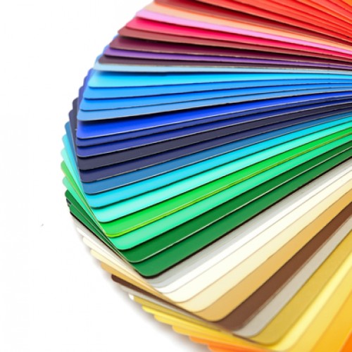
Do you remember the color wagon wheel you learned about when you were a kid. It had similar colors adjacent to each other and complimentary colors directly opposite. Using this concept, there are many combinations you can make; some of which are:
- Complimentary colors produce a contrasting effect that make the elements pop-up in a horde of miscellaneous items. However, one needs to make sure not to overdose it to an extent that it compromises the content.
- Colors that are analogous to each other blend together nicely and create a relaxed visual appeal. It’s recommended to use this combination in the background for a clear design that differentiates the text.
- When picking a blend of color, one can follow the rule of threes, which is quite liked by the Americans, as it’s more appealing and satisfying for the eyes.
Choosing the Right Label
The worth of your product is not solely based on the label design, but also its material and color. Here are a few variations you can try:
Clear Labels: If you have invested much in your packaging to be transparent enough for consumers to take a view, placing clear transparent labels is a smart choice. It’s a modern trend followed by many companies to showcase more transparency in their products.
Metallic Label: Add a touch of charm and sophistication to one of your premium products with metallic labels of gold and silver, which depict a sense of quality and extravagance with ultimate gloss.
Pastel Label: Pastel colors are soothing to the eyes, and it induces candidness and vivacity. It can be used for labeling feminine products, since such a blend is commonly associated with womanliness.
Brown Kraft Labels: These handmade labels made of brown paper create a seamless appearance, and are associated with product consistency that brown color represents.
Fluorescent Labels: Neon color can breathe new life into a product with an upbeat reflective light that catches the attention of a consumer at first glance. It can be used in moderation with fluorescent packaging material.
Experiment with Different Styles
Sometimes you can go beyond the conventional rules and create a distinct labeling pattern that has the potential to affect the performance of your label designs. There’s always a scope to experiment with the color theory and come out with something that you discarded earlier. Sell in small batches and in different variations. Track responses from social media or other platforms and see what people think about your designs. The one with majority of votes in your favor wins the cause.