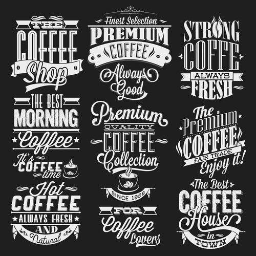
What is typography? From a simplistic point-of-view, it is the art and technique of arranging type. Unfortunately, typography is something people often overlook. In fact, it plays an essential part in a presentation process. Say for example, custom printed labels. It is pertinent that you ensure each logo your target audience see is specifically designed with a font to fit the brand. Believe it or not, typography can change the entire feel and look of a presentation, and that’s why it is so important. Before we talk about applying typography on your own sheet labels, let’s find out what the elements of good typography are:
The Key Elements of Good Typography
- Alignment: The proper alignment of type provides an unified look. If you want to create a sophisticated look, opting for a flush right or flush left alignment is the way to go. It also gives your copy a more defined edge line for the viewer’s eye to follow
- Hierarchy: You must use the hierarchy to intentionally guide readers through the content so it is being read in the order that it’s meant to be read in. For example, the title is the first thing your viewers sees, then your brand name, followed by the product’s features and then a ‘short story’ (if there’s space). If you do this right, you can pique the interest of an existing fan base and get them to pick up the product regardless of the title.
- Consistency: Always ensure that there’s a consistent use of formatting, bullets, leading, kerning and typefaces. It will make your piece look professional and your viewers will be more focused on the content.
Now that you know typography can convey a ‘feeling’ and keep people reading. Let’s find out how you can apply it to your labels.
Question #1: What are You Actually Labeling?
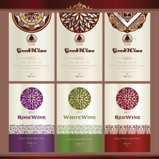
You should note that a font perfect for your jar labels may not be ideal for a poker chip or cigar label. Hence, you should determine what is the exact that can effectively define your product. For starters, you can study popular trends in your industry to grasp what is in style. For example, you may find that scripted typography complements a luxurious body butter better than harsh printed fonts.
Question #2: Who are You Targeting?
Next, you need to determine who you are selling your product to. Try it, you will find that it’s easier to select a font. When it comes to the actual selection, pick one that relates well to your audience and can make your product more appealing. Let’s say you own a modern brand and plan to target a younger audience. Opt for sans-serif fonts for a minimalistic look. For older audiences, you will find that fonts that are fairly large and easy to read will be more appealing.
Question #3: What is the Message You are Conveying?
The right font choice makes all the difference when you need to convey important instructions and get your message stuck in peoples’ minds. If you pick a font that will be iconic for your logo, people will want to read it through. Whether you want your message to portray a sense of professionalism, class, relaxation or etc. Make sure your font choice speaks to what your brand stands for!
If you need more inspiration, you can always check out our specialty labels here!