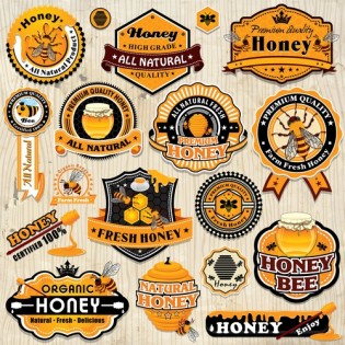
How often do you eat sweets or buy bars of chocolate for your children and significant other? Chances are, you do enjoy sweets daily. So by now, you must have noticed that sweets, chocolates, chewing gums and even biscuits are not packaged and labeled the same way they were packaged and labeled a decade ago. So much has changed, from including bar code and RF codes in the packages to adopting strange designs and colors. That is not everything though. As a matter of fact, consumers should expect to see more of the following trends in confectionary packaging and labeling.
Clean Label 2.0
Product labels should do more than advertise and market brands. They should enlighten consumers in a bid to help them make informed choices before a purchase. That is where the clean label concept comes into the picture. Brands are now rejecting any form of labeling approach that offers too much or too little solely because this can easily leave consumers confused or misinformed.
It is important to note too that consumers can easily reject a product once they feel overloaded with information. That is why labeling experts in the confectionary industry have embraced the essentialist design principle. The principle seeks to bridge between too much, just enough and too little. The objective is to bring calm and clarity for the shopper in an increasingly harsh and hectic retail environment.
Transparent Labels
This seems to appeal to modern young shoppers. It does not end at just transparent labels. Young shoppers seem attracted to unique designs, shapes and specific colors they consider trendy. To the young shopper, a product is just as good as its packaging. What the shopper looks at on a shelf should be impressive enough to make the shopper want to enjoy a confectionary without reading the label too much. As for the transparent labels, manufacturers realized this recently. A chocolate snack with a transparent patch is more likely to appeal to the young shopper than one that is covered with brand logos and colors.
Eco-Friendly Packaging
Labels that feature the words ‘recyclable, or ecofriendly’ are not enough. Today’s consumer is informed more than ever. He or she wants to know what the label is made of. So to appeal to environmentally conscious confectionary lovers, packaging and labeling experts ought to mention what the package is made of.
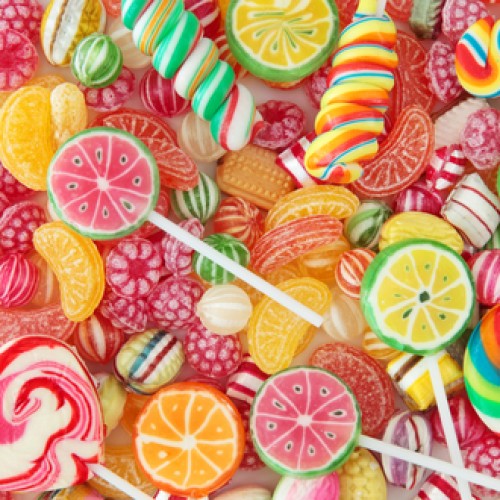
Color Psychology
This has everything to do with appealing to the subconscious. Couple this with subliminal advertising and you suddenly have a product that moves off the shelf within days. Product labels, especially in the confectionary industry, call for lots of creativity. There is little and sometimes no room at all for averagely designed labels.
Bright colors are smartly used to package sweets. Orange, sunny yellow and tangerine are all colors associate with happiness. That explains why sweets always feature packages with bright colors. That is not the case though when it comes to chocolates. The darker the design and packaging, the more expensive the chocolate. That is because darker colors, especially among young people are associated with class, sophistication and quality.