Marketing experts use several strategies to influence consumer preferences, promote purchase frequency, stimulate consumer demand, build brand awareness and encourage existing and prospective clients to purchase their products. These strategies often take time and are more often than not, backed by research. The goal is to ensure that a business or service creates a context where consumers easily perceive value for their money. But how do you achieve all these when the target market is made up of children? The ball game changes mostly because one has to come up with creative ways that appeal to children. One easy way to go about this is by using labels that children can relate to children. Here’s how to go about it when designing food and beverage labels for children.
Color
It goes almost without saying that children like bright colors. But over and beyond this fact lies yet another fact that product manufacturers understand well –colors affect moods and emotions. This happens to adults as well. Warmer colors such as yellow and orange bring about comfort and happiness. Red on the other hand has been known to increase the pulse rate and increase both appetite and awareness. Blue does the exact opposite. It slows down the heart rate and brings about a calming effect. This explains why children beverages feature labels that blend red, tangerine and sometimes blue. The bottom line is, these colors appeal to children. They also affect their emotions in a good way.
Colors And Associations
Children learn to associate colors with particular objects and figures. They associate yellow with earth movers which is why energy supplements feature different shades of yellow in their labels or commercials. While these may seem like farfetched examples, marketing experts understand the psychology behind them. This is the main reason why cartoon characters used to market fruit beverages meant for children always have a given color. Grape fruit drinks use purple cartoon characters to appeal to children. A green label with green cartoon characters will have a negative effect if one was to use it to woo children into buying grape fruit beverages. The bottom line here is to come up with labels that children associate with easily.
The Mirror Effect
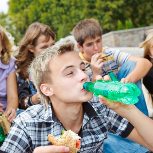
A product label targeting children should have children characters on it. This is what product labeling experts refer to as the mirror effect. The objective here is to make children identify with what they see on the label. This same strategy works on adults and the elderly. The rationale behind it is simple. A kid will have second thoughts compelling a parent to buy a product that exudes adult images and characters on it.
Design
Design is as important as color when it comes to product labels that seek to appeal to children. Factors like font and font color should not be ignored. To a child, a product is as good as its design. This explains why most products that appeal to children use stickers in their labels. Children make a habit of collecting the stickers after using the product. This is a win-win situation for both the consumer and the manufacturer. One uses the product and develops a hobby out of collecting the stickers. The other makes profits out of the designs and in the process, markets the product with ease.