The cosmetic and beauty industry is saturated with products and this makes it one of the most competitive markets in the world. For this reason as a cosmetic manufacturer, you need to come up with innovative ways to ensure your brand stays on top. One way your product can create a lasting impression to the consumers is by coming up with creative cosmetic labels. We have compiled 5 different labels to help inspire you as you come up with your next label design.
CannaCure CBD
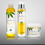
One look at CannaCure CBD’s products and you can’t help but gaze at it a few more seconds just to find out what it is all about. Now that is the effect a cosmetic label is supposed to have to ensure your product pops off the shelf. The designer of this label decided to use transparent containers that showcase the contents. For the label, he then chose to use colors that would perfectly blend in with the products color. He has balanced the use of imagery and text perfectly to give the label a simple look. The overall outlook of the label spells sophistication.
Morimax
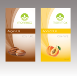
This label designs of Morimax is a perfect example of “less is more”. According to cosmetic label trends in 2017, most cosmetic manufacturers are looking to keep their label designs simple. As you can see from this example, the designer has used both imagery and text but in a conservative way. The text is straight to the point informing the consumers what the product is all about. The imagery even makes it simpler by letting the consumer know the flavor of the oil before reading which reduces decision making time. The less time a consumer has to think about a product the more likely she is to buy it.
Perfect Clear
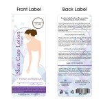
Perfect Clear’s label designs are great examples to look at if you are looking to have a front and back label for your cosmetic product. There a variety of things that you need to note in this example. In the front label, the designer has kept it simple by using imagery, color and text. In the back label however, he has incorporated a bit of color in the background and text. Note the size of the UPC code and signs used which is a standard requirement for some cosmetic products.
Dilecta
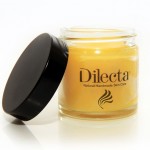
The label design of Dilecta are perfect examples on how to apply clear labels. The design is simple but yet it exudes elegance, sophistication and class. The orange color of the product makes the label design stand out. The label capitalizes on using the main point that the product is natural handmade and this is sure to rouse interest from consumers.
Skin Defend
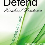
Check out Skin Defend’s labels as they show you the importance of using the right font on your cosmetic label design. The designer has skillfully used two fonts on his label design and has combined with use of imagery and color to create a perfect blend. Professional label designers usually advise against using more than two fonts in a label design. More than two fonts will make the label appear messy and may be an eye sore to most consumers.