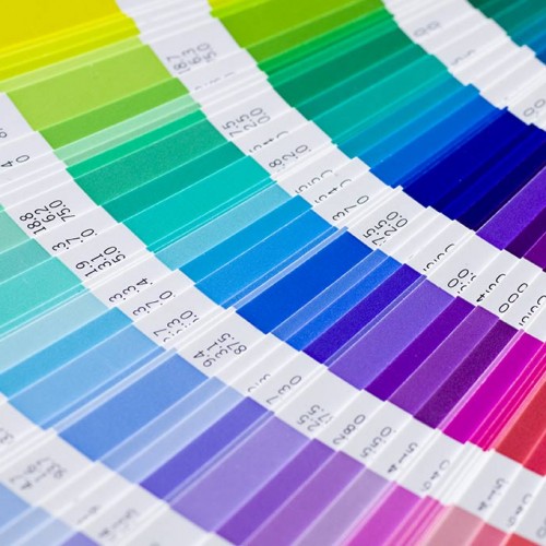
The different colors that we see everyday have been proven to affect our behavior as well as our moods in a variety of ways. In addition, everyone reacts differently to the colors they see either subconsciously or consciously. When it comes to product packaging, company branding, labels and logos, they are often designed with a very specific set of colors to trigger a favorable response from their consumers.
Color in a marketing context is undeniably a tool that has great potential. It has to be considered and chosen carefully to prevent it from having a negative effect on consumers’ approach to the related company or product. Human behavior and color is closely related, and through extensive studies, results have shown that color can lead to very different feelings depending on the origins of the viewer, religious beliefs, culture as well as location in the world. Below are some approaches and feelings that are universally accepted:
Blue
If you wish to show your prospective customers that your new product comes with premium quality, blue is a great color to add into your label artwork. Also, if you are retailer of business computer software products, you can use blue on your packaging as well as labels as they have that corporate look.
Red
Did you know that other than love and lust, the color red has the ability to increase one’s appetite? Many restaurant interiors incorporate this particular color and if you are manufacturing food items, it will be great to design your labels with the said color. As red also triggers some negativity, be sure as to not overuse it.
Green
If you want a product label that triggers feelings such as envy, friendliness and good taste, be sure to consider using green in your artwork! In fact, this earthly color can help tone down a product that has a very “loud” appearance.
Pink
Pink is a color that is adored by many females. They can be seen on handbags, purses, shoes and clothes. What better way than to trigger similar feelings with your labels! If you sell products that are more feminine, choosing this sophisticated color is the way to go.
Purple
It gives viewers a sense of empowerment and authority. It is also agreed that purple can also make a product look sophisticated and luxurious.
Black
Black has the ability to make a sophisticated product look even more expensive and exclusive. Black, as you might already know, can instill other feelings such as fear and grief.
As you noticed by now, each color has the potential to trigger some very contradictory feelings. When you design a label for your product packaging, the feelings toward a particular color has to be taken into serious consideration. Effective labels can convey meaning simply through the use of the correct colors. If you wish to influence your target audiences to react in way that’s positive, you can gather some feedback on their different reactions to your potential usage of colors. When you pick up the habit of considering the power of color, you can learn how to use it to your advantage in the most effective way possible. When your artwork is finalized and you’re ready to print, use a high quality color label printer!