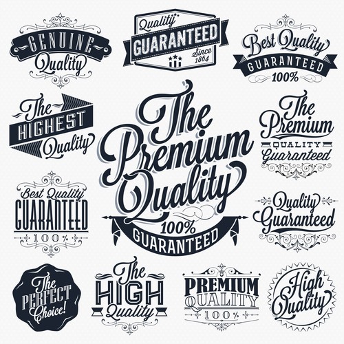
Fonts have the ability to deliver subconscious messages and they carry an emotional weight. According to Gestalt principles of design, a psychological theory, it states that the brain does not focus on individual letters, but rather applies a universal understanding to words in entirety. This means that the type of font you use on your decorative label design should have more value. You may choose a font that is not very readable, but it should carry an emotional weight to it and deliver a subconscious message about what you are promoting.
How To Create Personality From Fonts
Different fonts have drastic impacts on the personality you convey to your target audience. Decorative labels are supposed to be fun and for this reason you should choose a font that matches your personality. To better understand how font choices can evoke different emotions in people, let’s take a closer look at commonly used fonts.
- Script
The script font inspires feelings of femininity, grace and elegance. This font appears like handwriting and for this reason it is often used in expressions of affection. This typeface is perceived by audiences as genuinely heartfelt, creative and personal. Adding a script font into a decorative label design transforms it drastically. It is pretty and adds fun to the message being conveyed.
- Comic Sans
This font is plain and simple and has a laid back look to it. If your decorative labels are meant for a younger generation of people, this would be the ideal font to use. Comic sans typeface reflects the possibilities the future may bring and it is futuristic and intelligent. Using this font brings fun and joy into a label design as well as relaxing the target audience with an informal atmosphere. However, you need to be careful when using this font and make sure that your target audience will respond to it the way you want them to.
Why Typography Matters
It is true that a picture can say a thousand words, but people spend a lot of time reading text. Decorative labels are not as serious as promotional labels. However, they still need to be taken seriously when it comes to design. The type of font you choose should be fun, laid back and easy to read. Whether the decorative labels are meant for a party or a function, you should create labels that lend an air of professionalism and gravitas. Use decorative fonts that will make your labels stand out.
Use Familiar Fonts To Build Trust
The more familiar font you use, the more your target audience will trust the message you are conveying. Don’t use fonts that are not common as you risk alienating your audience. Also, you should not be tempted to use more than two fonts in one label design. Using more than two fonts in a label design only makes it confusing and your target audience may not get the message you are trying to convey
Bottom Line
As you can see, the type of font you choose for your labels really matters. A font not only adds an aesthetic appeal to your labels, but it also helps to add personality. If you are planning to leave a lasting impression with your guests, ensure that you use a font that shows you really appreciate them coming to your party or function.

